The 8 top design principles are very important for designer improve work efficiency and create user experience, user interaction and user friendly website for visitors. The 8 most efficient principles combine the principles of usability, user experience, user interaction and visual principles. The 8 most efficient design principles can bring a deep understanding about user friendly website design. Read The Ultimate Guide to Ford Transit Limited Lease before making an important decision for your business.
1.Top Design Principles One- Make Website Design Don’t Let User Think.
Do you know how people read on your website? When people visit your website, they do not read much of the content. Instead they are focusing on some area, such as first paragraph, typical headings, bullets and first eleven letters of each chunk.
Faced with the fact that your users are finding some important things in your website, not focusing on every detail, so it is important for you to create effective visual hierarchies, break pages up into clearly defined areas, make it obvious for clickable button and eliminate distractions (Steve, 2014). You also need to know, formatting is efficient to support users scanning at your website.
For a user friendly website designer, you should know Eye tracking technology. It is an key technology for designer to efficiently design important points in right place and attract users’ attention. It also can make a page looks user friendly and highlight the importance in the website. From the eye tracking research from Pernice,K. & Nielsen, J (2009) people usually spend their time on the red and yellow color area, while pay less attention on the area of cold color, such as blue and purple color. As you can seeing in the following picture, people’s gaze move across the page near the top and then moving down the left hand side with movement across the page from time to time.
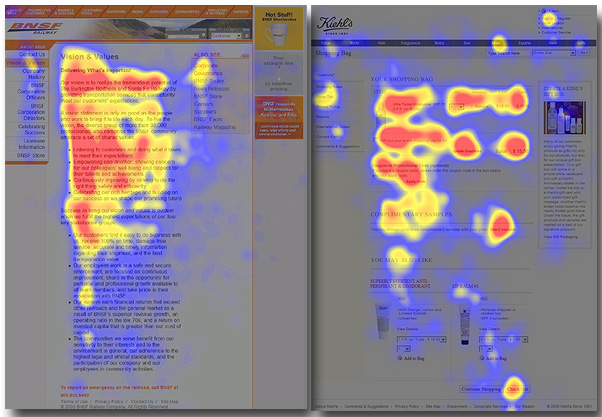
- The efficient design should focus on navigation bars, summary of the page’s content in the first paragraph, heading of each content and first eleven letters of each chunk. People usually scan the key part of the page quickly to decide if it is relevant to their needs.
- Designers need to convey the most important information in those key areas. Using those key areas to explain the content and character of the website. For example, correctly use of headings, sub-headings, paragraphs, bullets or lists to make those key area easy for people to scan.
—If you are building business website, using bold face, short sentence, bullet points with the information and lists to carry words. You should create meaningful sub-headings, one idea per paragraph. It can give reader a clear formatting and easy reading pattern.

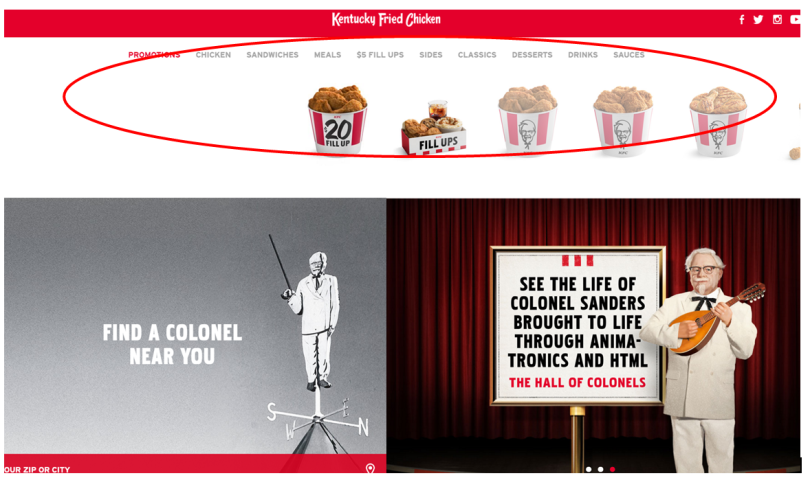
—If you are building a product website, you should carry the most valuable information of the product in the navigation bars and summary of the page, and a clear hierarchy to give user clear guidance for your product. For example, some website show its visual products in the most attention area, such as KFC.com, to give visitors the quickest access to find its most popular product.
2. Top Design Principle Two- Keep Consistency.
An efficient design for user friendly websites is to make user easily find what they are looking for without distraction. Keeping consistency is the basic user experience principle for visitor quickly find their expectation and for designer most efficiently design a friendly website.
It has internal consistency and external consistency.
2.1 Internal Consistency
- Internal consistency is to make your website in the same design for the content behavior and control. The design for the content and behavior should remain largely the same within the screen and features for different page and sub-page. If your website has the same type of information should have all elements positioned in the same way every time (Schlatter& Levinson, 2013). This is the most efficient design principle for visitor get accustomed with your website and easily finding what they want at first view.
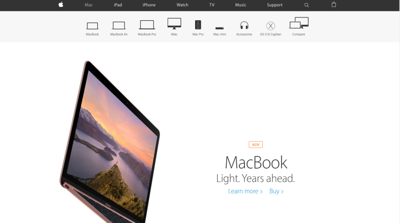
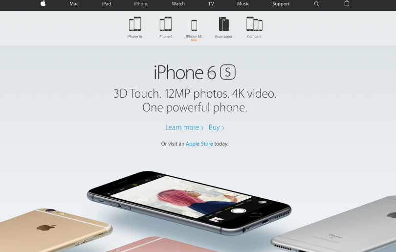
- If there are different elements that related to one another, the elements should maintain their spatial relationship no matter which page they are. For example, the Apple keeps consistency format, color, navigation, content in its homepage and each sub-page. The clickable behavior of each page keeps the same as well.
2.2 External Consistency
- The external consistency is to make the design fit for users’ mental model. Users always have mental model based on their previous online experience with similar website, software or devices, their know and what they belief. It is not a fact, but it is a habit.
- Users have mental models about navigation, button location, website content, behavior operation in website. They may like search bar shows in the right top of the screen, the logo shows in the left top of the screen, the navigation bar shows in the top of the homepage. For example the web page from Sony.com. Designer takes popular mental model to design its homepage.
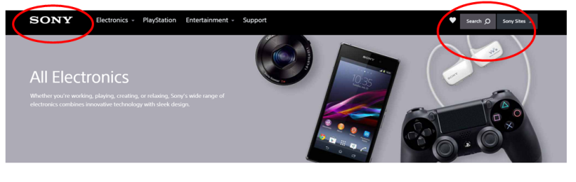
Picture retrieved from http://www.sony.com
- A user friendly website designer should know your key audience’s mental model and keep external consistency. Combines your those mental model with popular mental model to build a efficient user friendly layout, operation, navigation and font for your users and visitors. You can get the results from your audience mostly visit websites, mostly used software and mostly popular website in that area.
- However, this is not means you cannot put the search bar or logo in the middle of the screen and in other places. Instead you follow their mental model to build an efficient and user friendly website for them. Keeping external consistency will be very easy for your visitors to access those buttons, to know where they are, find what they want and visit your website again. For example, in the homepage of Sony.com, The logo is clearly shown in the left top of the screen and keeps consistency in every page. Users mentally scan it and know this is Sony’s official website. The search bar shows in the left top of the page. When user wants to search something, they will quickly find it.
3. Top Design Principle Three- Structure Your Navigation
The efficient navigation should include all the mental model elements. Elements are the Name of the website, information that the website want to spread, relevant images, text and navigation(Chris Nodder, 2015).
- Efficient Navigation label should use the words that your visitors would normally use. By doing this, your visitor can understand which section is most likely to be right for them. If you navigation words are mainly nouns,which are mainly description words, you can create category splitting up page to different types of contents on the site. For example, the brand website will show the categories with most daily words, such as bags, wallets, watches and clothes, to efficiently give visitors access to their right place.
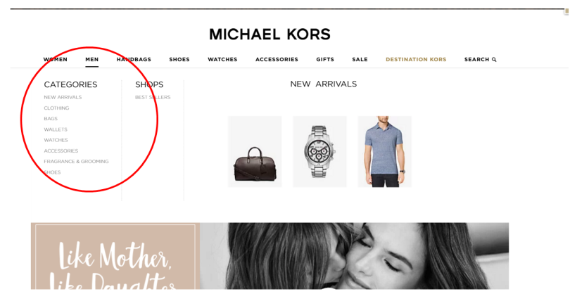
Picture Retrieved from http://www.michealkors.com
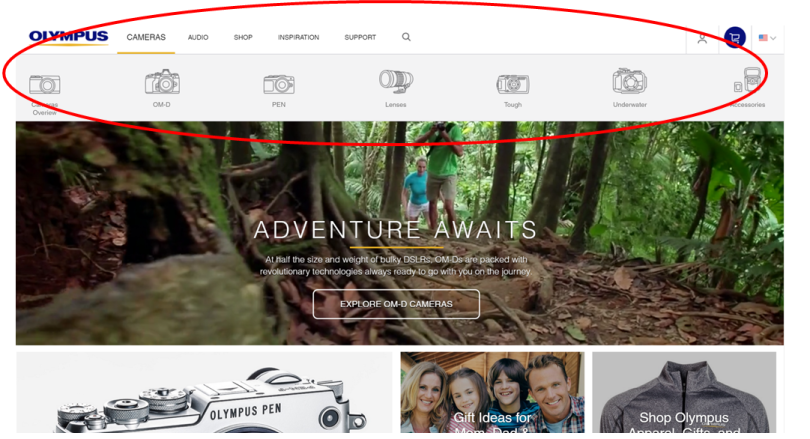
- Navigation bar usually display in the top of the website, or the left side of the screen based on how many content you have in the navigation.
—If you have many long list of items, such as Ebay.com, you can use the vertical list.

—If you have just few item categories, such as three or five key categories in your site, you can choose the horizontal list, such as Olympus.com. You can put visual graphic of your products for visitors visualized know your products.
However, it is opposite.
- It is not very user friendly if you don’t structure your navigation bar in your site. Visitors are easily lose track, when they go to your website.
- The menu in your navigation should no more than three clicks away from your homepage (Chris Nodder, 2015). If you really have a lot of sub category page, make sure you have great headings, summaries and other contents with each page, so that visitors will have a strong attention.
- The menu should be not on longer than 9 items (Chris Nodder, 2015). It is from psychological research about short memory for human. Human’s short-term memory cannot hold in more than 9 items at one time.
4. Top Design Principle Four- Clear Layout In Every Page
An efficient design principle includes a good layout. People come to your site because they are finding something in your site. Your layout should not distract and obstacle their finding. You should create clear layout in every page, where the visitor is within the site and what they can do from that point .
Although the homepage is a good place to let people know what your site is about, it is not the only place you should clearly design layout for that. A clear layout in every page will always help visitors know what they can work their way around it.
4.1. layout of category page
- The category pages are the top-level page as the navigation bar in the homepage. It can help visitors to know the key point in each section and allow them to navigate to sub-content. Category page works as a top down menu for information within the section. Thus the layout of the category page should display the most important or most recent information in this area of the site. People can drill down to more detail by click on the clicks to detail page or to sub-categories. Since category page must have a lot of topics, the layout of the category page should
- Sub-category pages should follow similar layout of your category pages.Each link in your category and sub-category page should go straight to your detail page.
4.2. layout of detail page
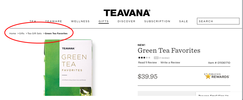
- For the detail page. This is the main part of each page to show the only one concept of the item. It should focus on the core topic. For the layout of detail page at user friendly website, designer should give visitors a“sit map” to help user quickly work up and down levels of content to find exactly where they are and what they need. It usually shows in the left top of the page to tell visitor their location of website. For example, the product website provides visitor the “sit map” in the left of the page. It tells visitors they are in the “green tea favorite” pages and where the location of this page. It allows them to search up and down levels of content quickly.
- Remember people might will go to the detail page from search or related links. For this reason, the layout should have a small introduction for the detail page so that visitors can understand whether they reach out the right content. A user friendly layout of detail page should include related link area to quickly access different detail page and sub-category page
- The layout display of detail page includes scrolling page, a series of sequential page or splitting the pages by level of detail.
5.Top Design Principle Five- Readable Font
An efficient design for a website includes providing a readable and easy-to-scan font for visitors. Remember San Serif fonts are the best and most widely accepted for online design and print design. Serif, Arial, Time New Roman are the readable and user friendly font too. When you design your page, you can choose any of those fonts based on your content and your habits. Verdana and Georgia are the best second choose for the web page design.
6.Top Design Principle Six- Contrast Color And Consistent Color Strategy
Efficient design for user friendly websites must include a smart color choosing strategy. Best color can make a good first impression for your visitors. A user friendly website should not include more than three/four main colors. You can have many format colors but your main color for your website should keep at three/four or less, or else you will distract your visitors.
The main color can from the color of your logo, background color of your page or your favorite color. The color of your website is best combine the cool tone color with warm tone color. It can psychologically bring most comfortable and balance feeling for people.
When you want to highlight something, you best use the color that is highly contrast from your background color or background picture. But you should remember keep in consistency with your main color in each page.
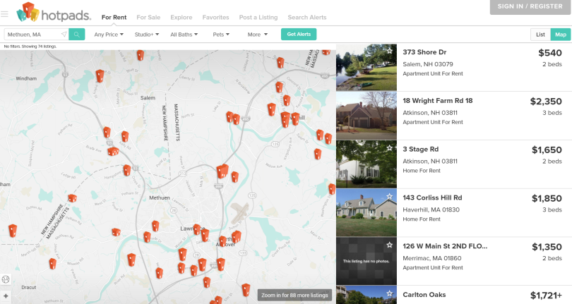
For example, the below website follows the efficient color strategy- use contrast color to highlight and use main color to consistency. The main color-red,blue and yellow is from the logo. Designer take red color to shows the pin. It not only keeps the consistent color from logo, but also makes contrast color from background. Using the blue color to show the highlight is also make contrast from background. This color principle will not give user distraction and It clearly shows the website topic and allow visitors find their want.
7. Top Design Principle Seven- Relevant Image and Make Graphic For Explanation.
An efficient design for user friendly website should use appropriate image to communicate with visitors. A relevant image for website can help branding your website and efficient connecting your target audience.
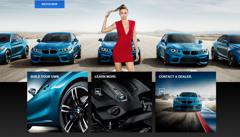
The most basic principle for a user friendly website is to simplify. Image can be used as the best tool for you to explaining website and keep simple.Efficient design principle is to make your graphic for explanation, not decoration. Relevant image and graphic to your theme of websites can help you simplifying your web design. Every page is valuable, so don’t waste it with useless graphics. For example, you can use detail auto tire picture and engine picture to show how special function of your auto has at an auto website.
8. Top Design Principle eight- Quick and directly feedback
An efficient design of user friendly websites should not let your visitors wait for long website load time. Visitors should get quickly feedback from their click on any buttons or links at your website. Visitors always will lose track or close the web page when they are waiting for a page load more than 6 seconds.
Tips to make load time more effective are (Woods, 2014)(Segal, 2015):
- Optimize image size and scale, using either GIF, PMG-8 or JPEG as file formats. Make sure the size matches your usage and set the size for each page with height and width;
- Combine code into a central CSS or JavaScript file.
- Simplify HTML, CSS and JavaScript in your website, remove unnecessary comments, white space and code.
I will introduce more detail design principles on layout, color, wireframe, etc of user friendly website in my next post. If you like the post, Follow me by clicking below the “follow button” in the bottom of the page. More efficient, useful and practical design tips, principles, examples, experience for user friendly websites will come soon.
Welcome your comments and discussions.
Reference:
Krug, S. (2014). Revised. Don’t make me think: A common sense approach to web usability. Pearson Education India.
Schlatter, T., & Levinson, D. (2013). Visual usability: Principles and practices for designing digital applications. Newnes.
Chris Nodder (2015). User Experience Fundamentals for Web Design. Retrieved from http://www.lynda.com
Sofia Woods (2014). 10 Top principles of effective web design. Retrieved from http://shortiedesigns.com/2014/03/10-top-principles-effective-web-design/
Nathan Segal (2015). 7 Tips to make your website load faster. Retrieved from http://www.htmlgoodies.com/beyond/reference/7-tips-to-make-your-websites-load-faster.html
37 Comments