Data visualization is a form of communication that portrays dense and complex information in graphical form. When I design the data and want to translate the data number into a graph. I faced challenges. How do represent the data while being able to leverage human cognition to communicate quantitative information quickly? What are the best practice and principles to express data of varying types, and sizes and help users navigate them with context? As a UX designer, I know my job needs to find powerful solutions to flight those challenges.

I went to read and learn courses. I tried to find a pattern in data visualization that use in design and well-telling stories. This article here is summarized the reading of the book Storytelling with Data: A Data Visualization Guide by Cole Nussbaumer Knaflic, Fundamentals of Data Visualization by Claus O. Wilken, a course of data visualization for business from my company’s learning center(Cisco), and many online blog posts I read about data visualization In the past few months.
My goals in learning data visualization enable the user experience design to express data from the scale of a few data points to large multi-variant data sets, and to well-prioritize data accuracy, clarity, and integrity. In the end, the user interface design can present information that doesn’t distort meaning and help users to navigate the data with context and affordances that emphasize exploration and comparison. Ultimately, achieving the dataset can help users in quick decision-making and take action.
I summarized them into 5 key points here, that combined human cognition, business storytelling, and data visual storytelling. As we all are UX designers, not too visual design-driven(compared to visual designers), and not too business-driven(compared with product managers), I hope those 5 important tips can help you to represent your dataset at a high level of touching the points of both sides.
1. Design for specific audiences and their needs
Creating nice data visualizations is similar to designing the user experience for a product. The first step is empathy with users and considering who is your target users and their pressing needs.
Discover your audience
Identifying the persona is the starting point to prevent your design from falling at risk. Who is the target persona your data visualization is designed for? Who will look at the data? We need to do more than simply track the user persona, but prioritize the key user group to target. If your product serves multiple personas at your organization, prioritize the key persona to target first. The reason is to monitor user behavior and measure effectiveness and share the results with everyone, including your stakeholders. Designing for specific audiences and their needs is the starting point to business data visualization storytelling as well.

Identify your design goal
Before you put the data into design. Do you want to convince or clarify the data point to your users? Ask yourself, What decision do I want the audience to make, and under what circumstance? How frequency of the decision-making should be designed to align users’ needs? what actions do I want users to take with these insights? Is it to generally empower them to act or be backed by view data with evidence?
For novice users, your visualizations should be structured, unambiguous, and engaging. They should spell out data directly, in words, what viewers should take away from the data.
For expert users, on the other hand, we can show a more granular view of the data to allow for reader-driven exploration and discovery. Detail and data density should trump simplicity and clarity.
2. Choose the right visual
Data visualization can be expressed in many different forms. How do you know which type of data visualization works best? Charts are the most common way of expressing data. Table lists are the most recognizable to record and show a lot of information in a structured way, but sometimes, they may overwhelm users who are just looking for high-level trends.
What type of chart you choose depends on two points:
- What’s the data you want to communicate?
- What do you want users to convey about the data?
How to choose one visual chart over another? There’re 5 most used chart types to help you decide.
The 5 most popular types of charts
Multiple types of charts can be used to depict data. I summarized them into major 5 types. It combines the insights from material UI data visualization, and a directory of visualizations in Fundamentals of Data Visualization (Claus O. Wilken), to help you decide how to choose one chart over another.
-
Change/Trend Over Time
When selecting this type of chart, ask yourself — Do you want to analyze trends in your data set? This chart type is for you to plot changes and trends over a period of time or trend, or comparison across multiple categories.
Charts to use in this category: Line chart (best option), Area chart, Bar chart, Stacked bar chart, Timeline chart, histogram, etc. (See graph 1)
Use cases: Map continuous data, such as traffic spikes, increasing or decreasing in sales or variations in stock prices, the daily number of visitors to a site or weather, exchange rate over time, etc.

2. Category Comparison
When selecting this type, ask yourself — Do you want to compare multiple values or categories? The comparison chart compares data between multiple distinct categories.
Charts to use: Bar chart (best option), grouped bar, pie chart, donut chart, scatter plot, bubble chart, parallel coordinates, etc. (See graph 2)
Use cases: Internet usage by World region; Income across different countries; Team allocations; Height Versus Weight of Individuals by Gender

3. Part-to-whole/Proportion
When selecting this type, ask yourself — Do you want to compare values? Part to whole charts shows how partial elements add up to a total. Pie charts are used to show parts of a whole.
Charts type to use: Pie chart (best option), Stacked bar chart, Donut chart, Stacked area chart, Scatter plot, sunburst, etc.(See graph 3)
Use cases: Consolidated revenue of product categories; Behavioral targeting programs aimed at marketing; Budgets

4. Distributions
When selecting this type, ask yourself —Do you want users to understand the distribution of data? Distribution charts help you to understand outliers, the normal tendency, and the range of information in your values.
Charts type to use: Histogram(best option), Candle chart, Density plot, etc. (See graph 4)
Use cases: Population distribution; Income distribution

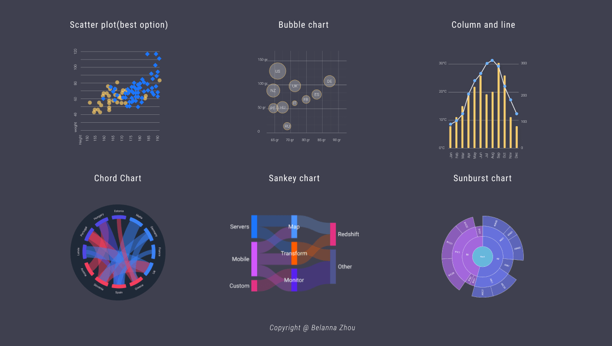
5. Relationship & Correlation
When selecting this type, ask yourself — Do you want users to better understand the relationship between value sets? A relationship chart can show how one variable relates to one or many different variables. It shows a connection or correlation, and how multiple items relate to one another.
Charts to use: Scatterplots(best option), Bubble chart, Column and line chart, Chord chart, Sankey chart, Sunburst chart, scatter plot, parallel coordinates, etc. (See graph 5)
Common use cases: Social networks, words charts; income, and life expectancy.
Map Visual Elements to Aesthetically Play
Visual salience is a powerful tool in data visualization. To make visual elements stand out against its surrounding can use to guide users’ attention to help present information overload.
The human brain responds well to some visual variables. A critical component of the graphical elements is position, color, size, and shape(Figure 6). The line width and line type are used to compose the X-axis and Y-axis. For example, The position normally describes where the element where is located. Many other aesthetics we may encounter in a data visualization. For example, if we want to display text, we may have to specify font family, font face, and font size, and if graphical objects overlap, we may have to specify whether they are partially transparent (reference from Fundamentals of Data Visualization by Claus O. Wilken ) To map data values onto aesthetics, we need to specify which data values correspond to which specific aesthetics value. For example, if our graphic has an x-axis, then we need to specify which data values fall onto particular positions along this axis.

Color is a powerful element. It can be used as a tool to distinguish discrete items or groups from surroundings to highlight or represent data values, such as income, temperature, or speed by using a sequential color scale(figure 7).

3. Providing context leads to action
Providing context is clear and concise ways ensures the data visualization can establish trust in your users, which can ultimately lead to actions. The goal of data visualization is first to present information that doesn’t distort meaning and help users to navigate the data with a clear context that emphasizes exploration and comparison. Secondly, the design of data visualization can help users in quick decision-making and move forward.
In order to drive action, the viewer needs a clear understanding of how the data performance compares to something tangible, like a goal or benchmarking data from a previous period. The more context and clear visual representation, the easier it is for the viewer to know where the action is required. For example, we want to present metrics in comparison with dynamic thresholds in data visualization to help your audience better interpret the numbers that they’re seeing.

Use Headline and Visual Hierarchy to Create a Narrative Flow
Always place the important high-level information in the first place that a user will view. The best visualizations tell compelling stories. These stories emerge from the trends, correlations, or outliers in the data, and are reinforced by the elements that surround the data. These stories turn raw data into useful information. This includes providing the user with an easy and reliable way to understand the status of their KPI and make fast interpretations from their data. The title of the visualization, for example, should kick off the narrative by explicitly stating the single key insight the reader should take away from the visualization. (Figure 9)

Clearly label your axes
Make sure the viewer knows what they are evaluating. Use horizontal labels to improve readability, for example, start the y-axis and x-axis to appropriately reflect the values in your graph in the bar chart. (Figure 10)

4. Keep things simple and digestible
The bad data visualization easily overwhelms users. The clear data hierarchy and use of white space are important to tell clearer stories. The goal of designing the data visualization should help the audience to:
- Quickly understand high-level overview information
- Help them to explore more information as needed
- More readily use the data visualization to answer questions and strategize effectively.
Some tactics to help create a clearer data visualization:
Remove distracting chart elements
Grids, varying colors, and bulky legends can distract the viewer from quickly seeing the overall trend.
Order your bars from left to right in such a way that exposes a relevant trend or message.
Avoid comparing too many categories
You don’t want your chart to become cluttered or hard to read. Visualize the data you need to tell your story, nothing more. For example:
- Line chart: don’t plot more than 5 lines to avoid visual distractions
- Pie chart: Don’t illustrate too many categories in ensure differentiation between slices.
Directly label data point
Far too many designers rely on legends to tell readers which symbols or colors represent which data series in their charts. Legends, while easy on the designer, are hard on the reader. They force readers to scan back and forth between the legend and the data, putting unnecessary strain on readers’ working memories.
A better alternative is to label data series directly on the chart. It’s often more of a challenge, but hey, you’re the designer. Your job is to do the work so the reader doesn’t have to. In the example below, the sale report can be designed to avoid using a legend, creating an interactive multiples display with small direct labeling to the line chart(Figure 11).

5. Design for user engagement
Ultimately the goal of UX in data visualization is to merge the experience of users’ workflows with actionable insights, and suggestions, encouraging user engagement for driving their next best action to take for the task at hand.
Circle back to the 1st point I mentioned in the beginning, designing for specific audiences. Ultimately, the savvy users will still be able to drill down the data and discover patterns and anomalies, but they won’t be burdened with an overly complex chart or data information. The novice users will be able to find some learnable experience to explore and find the simple and focused information ensure to build effectively.
Use (but Don’t Rely On) Interactivity to Facilitate Exploration
Interaction can be a hook to grab the user’s attention and get audiences personally invested in the project and do further exploration. Interaction is great for the integration of additional data to allow the interested viewer to explore the data set more deeply.
However, interactive visualization design cannot rely on building users’ key understanding. Key data must not be hidden behind the interactive element, and instead should be available without interaction. Research study shows only 10–15% of visitors interact with the chart from NewYorkTimes report.

Reading suggestions
For all who would like to learn more about this topic, I highly recommend reading Storytelling with Data: A Data Visualization Guide by Cole Nussbaumer Knaflic, Fundamentals of Data Visualization by Claus O. Wilken . Many of the ideas in this article are inspired by this book.