5 key factors apply in heuristic evaluation in UX research
When I got the task of taking an expert review, my first thought was figuring out what it is and the critical ways of doing an expert review. After I did the expert review for my company’s products, there’re 5 key factors I believe everyone who is responsible for this task or interested in understanding Heuristic Evaluation should know.

1. The purpose of UX Expert Review
When we try to understand the purpose of UX review, the first thing we should figure out is the foundation of UX review, which is what, why, and how.
What’s UX Expert Review
An expert review, also known as heuristic review and usability audits, is a usability inspection method in which one reviewer examines a design to identify usability problems. Usually, it is a valuable and cost-effective method of ensuring your website and app design are usable and providing the right experience for its users.

Why Do Your Design Team Need It?
- To get a fresh perspective. The reviewer usually was not involved in creating the design to be reviewed, so the perspective would not be basil. The reviewer has a deep knowledge of usability best practices and a large amount of past experience conducting usability research.
- Inexpensive and quick. The examiner can provide some quick and relatively inexpensive feedback to the designer.
- Flexible and repeatable. The design team can obtain feedback early in the design process. Assigning the correct heuristic helps the best corrective measures to the designer.
- Good for usability testing investment. You can use it together with other usability testing methodologies and conduct usability testing to further examine potential issues.
Common Methodology of Expert Review
- Cognitive walkthrough. It is designed to whether or not a new user can easily carry out tasks within a given system. It’s a task-specific approach to usability in contrast to heuristic evaluation, which is a more holistic usability inspection.
- Heuristic evaluation. In a heuristic evaluation, the UX expert will assess a user-interface in accordance with a predetermined set of usability guidelines.

2. When to do an Expert review
- At any stage. An expert review can be done at any stage in the design cycle. Usually, the expert review should be conducted every 2 to 5 years, outside of the main design lifecycle. It is used as a step back from current design concerns and for assurance that the design serves the users appropriately.
- Before a major redesign project. In some organizations, the expert review is used before a major redesign project to identify significant strengths and weaknesses of the current live design.
- Final milestones of a project phase. The expert review can be considered the final milestone of a project phase, where the design is measured against its original objectives and trigger the next phase: development and launch. But if there are no previous iterations of design critiques and prototype usability testing, saving the expert review until the end of the process would cause a lot of rework if major issues are not identified early!
3. Steps of Expert Review

- Step 1: Looking at the visual aspects. There’re a couple of key things. One is on the Visual hierarchy. Visual hierarchy is essentially about making sure the color is working harmoniously. There’s a right balance of contrast. The fonts work across the board. All high-level visual elements are coming to play.
- Step 2: Checking how does it flow. Flow is generally about making sure that things roll through an experience pretty smoothly. For example, the organization of content from top to bottom, left to right, does it read well? Does all make sense? Keep in mind that people need to know where to go and what to do. If they’re going to stay static on a site, they’re going to be consuming the contents.
- Step 3: Is the product engaging? When you are looking at the engagement, think about that there’s a level of engagement that already piques users’ interest and makes them want to stay on the site for more than three seconds and go deeper.
- Step 4: Does it make sense? To Understand the logic. The logic really needs to be about the flow. Whether the user can understand the logic behind the site. As much as you can do to make the product or app clear and apparent, the more successful your experience is going to be. The design should all really make sense to people. If you want somebody to stop and think, you’d better be important to what you’re trying to say.
- Step 5: Check the helpfulness. Do the users understanding whether what they’re doing or experience is helpful. Is this actually helpful to me as a user that points me in the right direction, so I can move further and deeper into the segment.
- Step 6: Derive the true value here. Whether or not this experience is truly valuable and worth my time or investment, or what have you For example, to check what are the topics here? How is going to back to the visual piece, how’s it presented that I can make sure that I’m seeing that there’s value here? Can I see at least two to three that are interesting to me, that is would say, you know what, this is actually helping me achieve my goal.
- Step 7:Look at how information is being processed. Is it conversational? There’re three types of information that can be shared. 1. It’s mutual, in a chat interface, there’s mutual conversational interaction happening. 2. Transactional information, where I can e.g. You might be filling out a cart and buying something, a successful message at the end of a form. 3. Disseminated information. All of the information is delivered in a way that’s consumable.
- Step 8: Is it repeatable? whether the product uses familiar metaphors and language. It offers a good opportunity for habit-forming experience. Make sure your users develop a habit of returning to it. When you’re delivering a site, make sure that has memorable content and effectively providing an action that is repeatable.
4. Goals of Expert Review
- Creating clarity. Your goal to number one is to provide clarity. If you are now reviewing a website, or you’re reviewing a pricing page or landing page, there are a few questions you can ask yourself that will help you understand if the page that you’re looking at provides clarity or not: Can people tell within five seconds of landing on your page what you provide and what the value is? Is it clear what page they’re on, and what actions they can perform on the page? Does the visual hierarchy on the page, both the copy and the images, help the user? Can people clearly identify what their next step in the process is?
5. Deliverable of Expert Review
When I finish my expert review, I came up with a review report where it has lists of screenshots, strengths, usability problems, and recommendations.
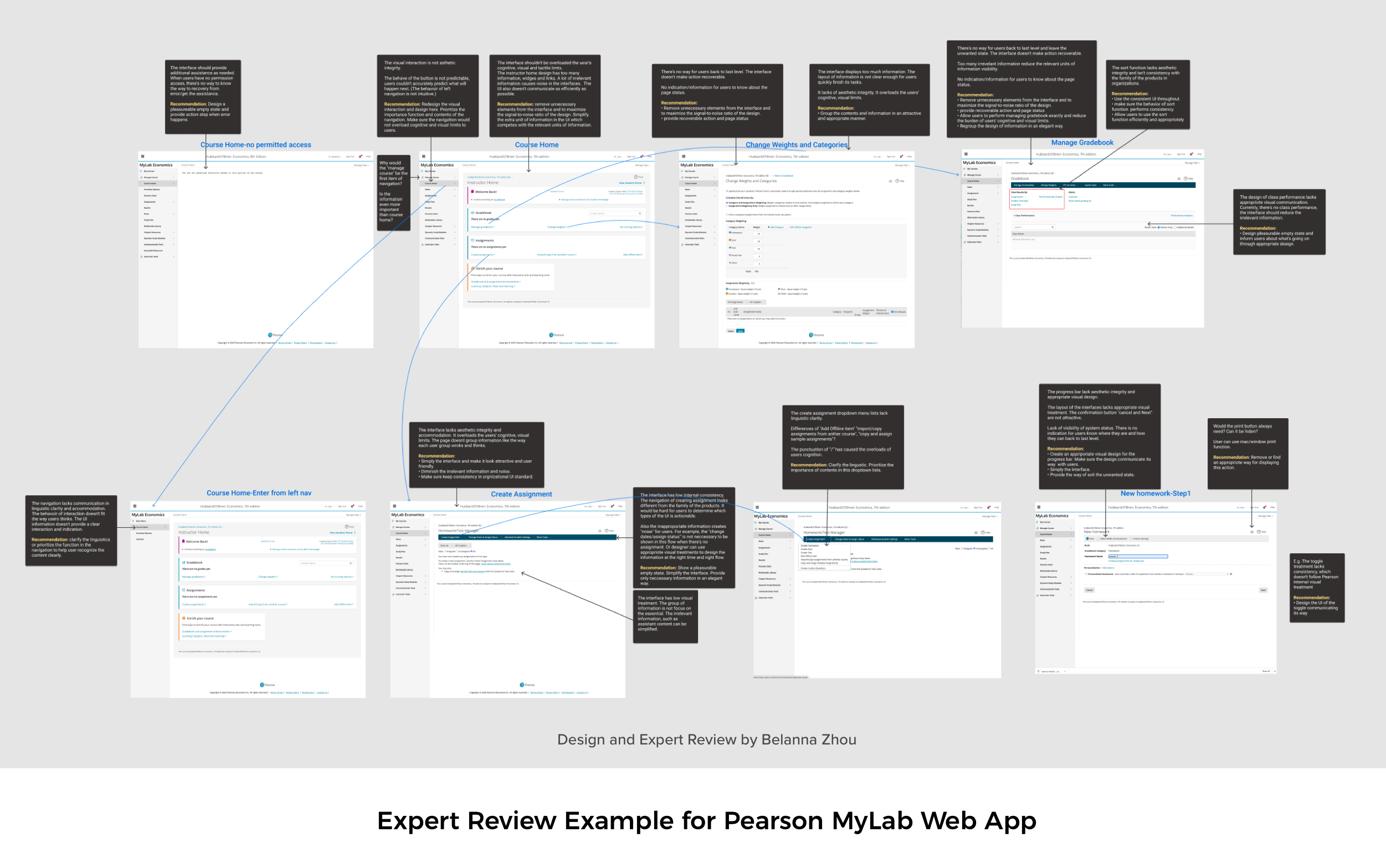
- List of usability strengths. With screenshots and descriptions.
- List of usability problems. With screenshots and descriptions. The descriptions should be based on heuristic principles (really strongly recommended). UX weaknesses can also be discovered by usability tests, or from an agency’s report with best practices.
- Severity Rating. Each usability problem should have a severity rate, in order to help the prioritization of the redesign work. I’m personally using a 5-point scale rating, i.e. Severity: 0=Not a usability problem at all; 1 = Cosmetic problem only, 2=Minor usability problem, 3=Major usability problem, 4=Usability catastrophe.
- Recommendations. Giving advice about how to fix the usability problem is a good practice in a design review, but it shouldn’t be mandatory because finding a solution is something that needs more research and time (and therefore more budget as well). Sometimes, the issue is easy to solve and the solution is obvious, in this case, the UX experts should provide the recommendation. The recommendation can also be based on examples from best practices.
Reference: https://designexcellent.com/ux-reviews/
Comments
Write a Comment