

Postcards Design – Gallop Global
Introduction
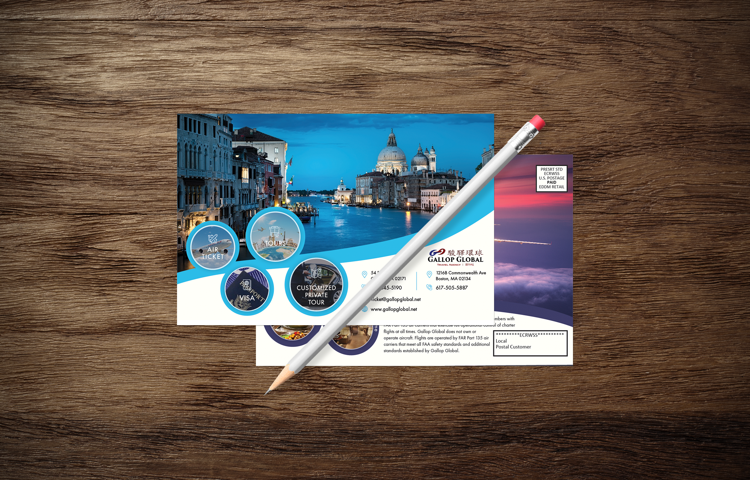
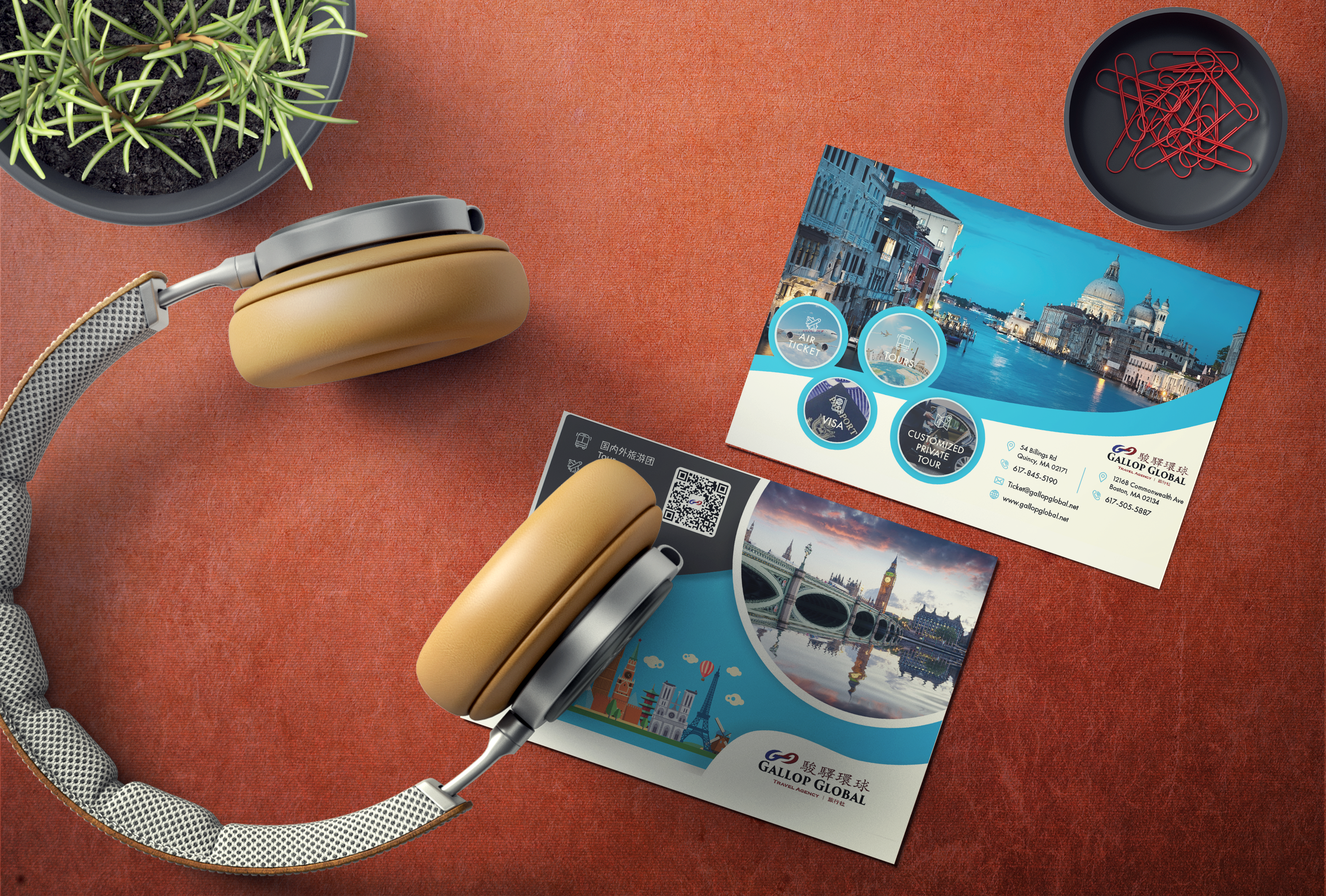
Those are the postcard design that I did for a travel agency. The agency name is Gallop Global and they focus on providing worldwide tours for Chineses and international people. This postcard design is based on their marketing requirements. The manager wants to have a good design postcard to show off their services and attract people’s attention when people get the postcard in the mailbox. They require two versions. one is bilingual with Chineses and English, the other one is only English contents.
What did I do for this project?
I redesigned the two postcards with two sides of each. They have a “bad” design before and they wanted to change it into good-looking and customer attraction postcards but keep their original plenty of contents in it.
I took this travel agency’s new website blue color and used circle shape to organize the many contents into a readable layout. I also illustrated the landmark building at some famous tour city. I use two different styles to design the postcard. In the bilingual postcard, I took an illustration and cute style. In the English postcard, I took a more business style to design the card. The style strategy comes up because I design them based on the different psychology of target audiences.
Here is the English postcard show off:


The bilingual postcard:


