


Grammar Checker Application
Redefining The Grammar Checker
Writing Review is an app that checks students’ writing for grammar, style, and plagiarism. It removes the pain of writing problems with innovative, seamless, and accessible user interfaces.
The new design increased reached the highest KPI 5 clicks expectation on the Analyze Button, increased the NPS score by 56% and average session duration by 10%, and reduced the bounce rate by 10%, and reduced the bounce rate by 10.3%.


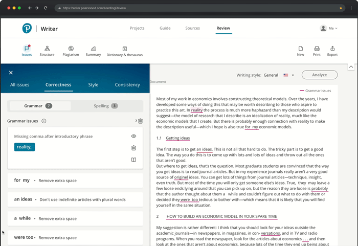
Design by accretion
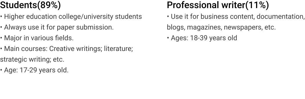
Target User
User Complain
“I felt frustrated with insufficient writing checking”
Before the redesign, I researched the past few years’ customer reports carefully.
 28% of learners reported to us the color and superscripts showed in the old design distracted them from completing the proofreading task.
56% of learners said that this tool provided many inaccurate checks, and it was difficult to resolve issued words.
78% of learners needed more proofread features to support all their different writing checking needs.
89% of learners mentioned that there was no plagiarism function that can support paper checking needs.
Business context
Cooperate With Third-Party
Since there’s no artificial intelligent team in Pearson that can support all the feature requests. ProWritingaid is one of the biggest grammar checking application in the market. Compared with the well-known Grammarly, it has more checking features and supports around 25 different checking functions. Around a few months of research, we decided to collaborate with ProWritingAid.
Goals & metrics
Fulfilling the Business Goal to Achieving Core Actions
Before I started the design, I collaborated with my product manager and business analyst to figured out the right expectation for the redesign of success metrics.
- Compared with a pre-test assessment of writing ability, learners’ post-assessment of writing ability is higher.
- Early indicator: 1-5 clicks on the ‘Analyze’ button in Review per user and per paper.
- Other indicators: Learners see errors in their paper/writing decrease after each use.
Tell you the story in 5 challenges
They’re features, layout, technical API, interaction design, and accessibility.
Challenge 1
How to Convince Product Owner
ProWritingAid is a powerful tool that supports 25 writing checking features, my product owner wanted to reuse the 25 features for the entire redesign. I carefully researched this vendor and found it’s not gonna work If we reuse the 25 features without prioritizing them. I know users would get overwhelmed again with many features to choose from. Users’ efficient checking needs cannot get fulfilled.
I pulled the trigger and recommended narrowing down 25 features to the 10 most needed features and organize the layout of 10 checking categories in an elegant and efficient way for my entire team. How to convince my product owners to consider the user-centered approach. I did a few processes:
First, to have the Product owner align what we’re building with what users want. I built the job-to-be-done removes the focus from the product itself and places it on the customers.

It helped the product team uncover the underlying goal that users were trying to achieve. To get a better understanding of what the market wants.
Second, I made market segmentation analyses to understand customers between ProWritingAid and us. Based on specific characteristics, both physically and behavioral to create hyper-focused sales for my team. By comparison, the segments of the target users’ differences in ProWritingAid and Person writer, helped my cross-functional team understand target users and resonate with their needs. It built a stronger marketing message and driving the business’s growth later by precisely reach the customers with specific needs and wants.

The analysis turns out that our product needs specific features to support our target users’ specific needs and wants. My product owner finally accepted my proposal and agreed to goes with the narrow down from 25 features to10 most needed features to redesign.
Challenge 2
Feature prioritization
How might we provide the right 10 checking categories to support users confidently submit papers?
I did 5 steps in 3 stages. In order for me and my team to find the right 10 checking features.
STEP1
Uncover insights from competitors for strategical design decision
I created competitor analyses by understanding these facets of how their features, functions, flows, and feelings evoked by the design solutions. By understanding those facets, I strategically generated design solutions to make a superior product experience.


Challenge 3: layout
Iterate Rapidly and Quickly with lower cost
4 Versions of Low Fidelity Wireframe Exploration
With the 10 writing checking categories on hand, I started to explore the layout and design. When I put the 10 categories into the design, I run into a problem. The 10 categories still made the page looks busy if I showed them all on a page.
How to build a simple and intuitive solution for users to efficiently find what they want and know where to go?
To flesh out my ideas. I explored 4 options that bundle the categories with the primary uploaded document so that users can flexibly check writing issues, and quickly change the issues in the uploaded document. But I also need to ensure that the category drawers and layout are lightweight as it’s such a big amount of categories.
Test
Cafe Study
Then I organized a cafe study and invited 10 participants.
Participants
6 users (4 females and 2 males) between the age of 18-25 years old. They were Pearson student campus ambassadors. Different universities in Boston, such as Northeastern University, Boston University, Tufts, etc.
4 co-workers (2 female and 2 male) between the age of 25-45 years old. They were writing lovers and grammar checking application frequent users
Methodology
I build the four clickable low-fidelity prototype and to ask them to interact with each of the prototypes and to check their thoughts on:
• Users could find the issues categories and clearly know the taxonomy
• Which one of the versions of design do they expect to interact with.
• What options do they expect to have in the issue drawer.
• What actions do they need to take when resolving grammar issues.
Study Results
• 8 of 10 The horizontal categories layout is better. It’s easy to see and read & fit human’s reading habits
• 6 of 10 Most participants suggested cutting down the numbers of the sub-categories.
• 9 of 10 Keep grammar, style, consistency in the issue tab
• As a reflection, they thought to group some categories together and separately display them as a new group would be good.
When the layout was decided, it’s time to design in detail now
Design goals drive clear design decision
I started to design the high-fidelity prototype after the layout was decided. My design goal drove me to build the design with a clear goal and know what I want to achieve. It made sure that my design final deliverable would the quality assurances as well.
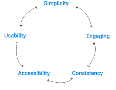
- Design simple, engaging, usable, and accessible user experience and users interfaces
- Reach out to students and professional requirements of writing projects proofread.
- Refresh the overall user experience, to build an easy-to-use grammar checking application.
Build for consistent customer cross-product experience
Meet Internal design system requirements
I also needed to ensure all the design I created were meet internal design system requirements, like icon style, focus indicators, ( such as button, tab style,) so users can easily onboard when they switch from the same company products

How’s 10 features finally layout?
Design
Simple selection for user make an efficient decision
Users can only choose from a certain amount of options before they stop enjoying themselves. I designed the right amount of options for users’ choice at each level. Also based on Hick’s law- the more options we provide for users, the longer it takes them to make decisions. The simpler navigation choices can improve decision-making and increase interaction efficiency.
Now the top navigation has three main categories–Issues, Structure, Plagiarism.

Interaction design
Core features easily discoverable
The visual hierarchy and affordance signifiers are easy to be discoverable. The symbol is designed with a clear label name. It is not only improved the efficiency of browsing but also ensured accessibility. To make sure the language speaks users’ words, I carefully collaborated with my UX writer had many rounds of language iterations to enhance the legibility. discoverability. The visual hierarchy inside the “Issue” drawer is easy for users to scan and read. Now it only contains the right amount of sub-categories under each tab. Clear organized information and categories help users efficiently make checking decisions and find what they want.
(play video see the interaction)
Challenge 4: API challenge
API Challenge with Third-Party
Since we used the vendor’s API for this entire redesign. To make sure what users want can match the vendor’s support was challenging. It required constantly communicating with engineers. Sometimes, I also needed to connect with the third-party vendor to figure out whether the design features were feasible to implement.
Innovation from API constraints
However, The API in prowritingaid constrained how many the solutions I wanted to show for each issued. What the ways I want to show for frequent words phrase. For example, if an article has the same issued words. Users must navigate to the word one by one in sequential order. This means, without a look at the first word, they cannot go to look at the second word. This sequential operation method required a lot of clicks and many user patients. It’s inefficient and would also generate user’s frustration. How would I make the innovation without breaking the API constraints? I simplified the sequential operation in a flexible way.

when there’re frequently used phrases, users freely choose any of them to look at without going to sequential order. They can resolve the issue as they want by clicking the blue box. On the right side of the content page, users are also free to select any one of the frequently used words in the content areas to look at. Once they select the word, the words on left drawer side respond accordingly.
Challenge 5: Interaction design & accessibility
Design for consistent behaviors and mental models
Users have built levels of interaction and behavioral expectation with similar products, especially with that popular day-to-day interaction design. How the design behaves and presents itself should match the users’ mental model as closely as possible, rather than reflecting the implementation of the model of how the product is actually constructed internally. I experienced over 10 industry popular applications. Researching their interaction, operation, actions, design standards, and convention for the behavioral aspects of interaction that most of the users’ built-in mind. I found the easiest to use interaction is the interaction of combining the most popular grammar checking tool Grammarly and Prowritingaid. However, I don’t want to build too many interaction methods to overload users’ cognition. I decided to limit the number of ways of interaction and operations to a few.
Buiding the external consistent design with industry popular pattern benefited users to complete the checking task without learning a whole new toolset. It improved learnability and efficiency and eliminated confusion.

Interaction design: non-drawer mode
Reduced click on “resolved an issue”
Before the “resolve an issue” requires 3 clicks at least, which is not sufficient and overloads users’ cognition. Now the flow of “resolve an issue” has been improved. The improved flow only requires 1 click. Users can easily hover over to the issue and easy to fix the issue.
Accessibility for Visual Impaired People
to make a proofreading tool accessible and designed the right signifier and affordance, minimum use of color for those low vision and color blindness users was challenging. It required much technical support and design iteration.
Accessible color and label use
For the accessibility standpoint, we cannot use color alone indicating its meaning, so the color in each of checking category, I designed a label legend, and always shows it on the right of the page to inform users about its meaning. I only used two highlighting colors in order to reduce the color distractions. if the page needs two highlighting colors at a time, I designed different highlighting shapes to improve accessibility performance.
You might want to see other improvements?
Other released features
Usability & Heuristic Updates
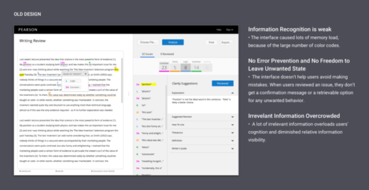
Let’s jump into the old design first. In order to update the new design with usable and heuristic support, I made some usability and heuristic analyses of the old design. Finding the right problems was the key to support the new design change with reasons.
The old design had a lot of heuristic and usability issues. Here’s some usability heuristic analysis of one page.
Provide Freedom for User Leave Unwanted State
 When users resolve an issue, there’s a popup message modal that shows up. Users can easily click “undo” in that message modal, they can recover from the error. If users resolve the issue as wanted, the popup modal will be replaced by a next resolve behavior.
User Flows Improvement
Coherent User Flow Improves Efficiency

User Interface & Interaction Design Improvement
Engagement Improve-Empty State and Successful State Illustration
In order to better present a successful/empty state, I drew three illustrations. Each of them represented different states when there are no writing issues or when users succeed resolve all of the issues.

Micro-Interaction
I designed a skeleton loading to improve the emotional engagement for users waiting on analyzing the document. Instead of design the simple spinner loading, I designed the skeleton loading improved the performance of users retains in our product
User Pain Point 
Students needed multiple clicks to dismiss an issue.
Solution 1 — Proximal Visual Affordances Clearly Communicate to Users to Interact
I designed three icons, which are used to hide, dismiss, and check synonym. The hide-an-issue would allow users to reopen the issue, which solves the users’ pain points. The Dismiss-an-issue is in the proximity place. it is easy for users to find the functions and take action.
The synonym feature is group proximity with the hide and dismisses feature. It efficiently provides users the capability the check for similar words and replaces the word with only one click.
Comparison of the old and new


Business results
Measuring & Celebrating Success
After released in 2020, we got much positive feedback from users. We focused on the success metrics at the very beginning of the project. And this is what we see

Summary
Moving forward and lesson learned
- As a UX product designer, we should always speak for our users. We’re the few people in a meeting stand for our users. When the business requirements conflict with user requirements, we should stand for our users and speak for them.
- Keep the first version of a feature or product as minimal as possible. Start with a conversation within the team, talking about your ideas and brainstorming to them. By doing this, it would build on your thoughts and also let teammates know your progress and maybe they would love to make their contribution.
- Test all of the assumptions early. I created a few wireframe options this time. I tested my assumptions early by hosting a cafe study. I quickly made a prototype to test my ideas. It identified the issues early and validate the thoughts. In the end, it helped the project finish early than planned.

